Pages

Showing posts with label Google. Show all posts

Tuesday, June 19, 2012

Google launches Google Offers iPhone app


Google has been serving up Groupon-style deals through their Google Offers service for over a year. They offer city-specific deals in each area they support, and allow users to buy these offers, and use them later. For example, a user would spend $15 for a voucher that can be used to buy $30 worth of t-shirts.

Until today, these offers were delivered on the Google Offers website, by email to subscribers of a certain city, or via a Google Offers app for Android. Today, Google released a Google Offers iPhone app that will allow users to browse through and purchase offers.
App users can see featured offers, browse through offers by category, check out offers in different cities, and view nearby offers on a map. The app makes purchasing an offer easy, and then lets you see your active offers, when they expire, and how far away they are.

Unfortunately, the Google Offers app is only available in the U.S., and Google only supports offers in selected areas. If Google does offer its deals in your city (click here for list), go ahead and download the app here.


Monday, April 9, 2012

Google adds App Search

A new option has recently appeared in Google searches, called Applications. When clicked, it searches for the query searched, but looks specifically for apps, searching sites like Apple.com (for iOS apps), Google.com (for Android apps), CNET.com, and more. You can choose from a few sites to search specifically, as to find certain apps that may be compatible with your device, or apps from a site you specifically trust.


A  full-size screenshot of the new feature in action can be seen here.


Sunday, December 11, 2011

Google Currents: News made Beautiful

Google recently announced their new news-aggregation application, called Google Currents. Currents allows users to browse many content providers (magazines, blogs, etc.), and add them to their Currents, where they would have easy access to their articles, as well as a beautiful way to browse what might interest you. Currents is available as a free app for iPhone and iPad, as well as both Android phones and tablets.

To add a publication, called by currents an "edition", you simply search for the content you want, or find it using the "featured" section, or from any of the categories, and add it to your currents. However, as this is a fairly new service, don't expect to find every publication that you read. Once you have added all of your desired editions, you can tap on any of them to view the content in a beautiful, minimalist design. 

Publishers can add content via a simple webpage, and can choose to add more than just simple articles. Publishers can add an updating section based on an RSS feed, a photo section that pulls in from Flickr, a video section hooked up with YouTube, and even a social update section, with updates pulled in from Google+ or any other RSS or Atom feed.

Google Currents already has many great publishers using the service, including PBS, The Guardian, and Zagat, as well as many well-known online blogs. There is no cost to subscribing to any of the editions associated with Currents. Users can also import any RSS feed, as well as easily import their Google Reader subscriptions, to quickly fill the application with relevant content. 

The one thing that makes Currents stand out the most from any other news service is the design. Google Currents' design is simple and elegant, making things easy to see, and making using the app an overall enjoyable experience. The one slightly disconcerting thing about the design and user interface is that, once in an edition, you can basically scroll sideways endlessly, as each article in an edition is laid out one after another, with the only thing distinguishing one article from another being the article's title. Although this works if you think of the content as a magazine, it can be confusing if you think as each article being a separate post. 

Google Currents is currently not available outside the United States. It would make sense for Google to have plans to roll the service out elsewhere, but no such plans are released at this point, so those outside the United States will just have to wait and see. 

Google Currents is free, so what is there to lose by trying it out? Download Google Currents for your iPhone, iPad, Android phone, or Android tablet, and, while you're at it, add Gadgetator to your list of followed editions by searching for us.

Watch the video below for more information about Google Currents.

Wednesday, December 7, 2011

Chrome OS: One Year Later

PhotoI never really imagined this day coming. But it's here. It's one year after Gadgetator's first post ever. So much has happened since them, and a big thanks goes out to Leo Laporte, host of the nationally syndicated Tech Guy radio show, on which Gadgetator got it's big boost. But enough about my blog. Let's get right to what this post's really about.

One year ago, on this day, I posted an article talking about Google's announcement of the Cr48, one of the major advancements in Google's Chrome OS operating system. If you are unfamiliar with what Chrome OS is, read the article here. In that article, I promised I would post a follow up after playing a bit with Chrome OS. I never did. Until now.

A lot has happened with Chrome OS in the past year. For example, a Chrome OS screenshot one year ago (see figure 1), as apposed to a Chrome OS screenshot today (see figure 2). After actually using a device running solely Chrome OS for close to half-a-year, I have developed a new opinion, and I'm here to share that. I guess this article is an overview of Chrome OS: one year later.

Figure 1
In a short recap of what was said in Gadgetator's first ever article, Chrome OS is basically a computer that only has a web browser. When you first open it up, you get your homepage, opening a new tab brings you to a page that basically contains a grid of glorified bookmarks. To a bunch of web pages. This all sounds great and all, but there's one major disadvantage. You lose all of your native applications. No more Photoshop, Microsoft Word, or iTunes. Everything you do has to be done online. Some might say that's impossible. That this'll never work. On first sight, one year ago, that's what I said. I quote myself saying, "There are great web apps out there, but I believe that for this to be a success, there need to be more great web apps. And until we get some of the most widely used native applications online, Chrome OS will be for the very light computer user."


Figure 2
After using Chrome OS almost exclusively for half-a-year, it's apparent I've changed my mind. You see, I was kind of pushed into using Chrome OS. Google offered its Cr48 to a limited number of beta testers to get feedback for the final product. I was one of those lucky recipients. 


Not wanting to just toss aside something  I received for free, plus taking into account what Google actually intended for me to do with the device, I decided to give it a fair try. I never really went back.


I was already stuck in the Google Universe. I used Gmail, Google Docs, Google Reader, and many other online alternatives to native desktop apps. As soon as I switched to Chrome OS, I found it surprisingly easy to find great online alternatives to any desktop apps that I need. Because I have a "real" computer, I could even print directly from Chrome OS using Cloud Print. Of course, I gave up some conveniences, but I believe that was a fair price to pay for the simplicity I now gained. No complex files, programs messing up your system, virus issues, or any other junk that comes along with a Windows or Mac computer. I couldn't have used this as my only computer, I still use iTunes regularly, but it definitely works a great, simple replacement.
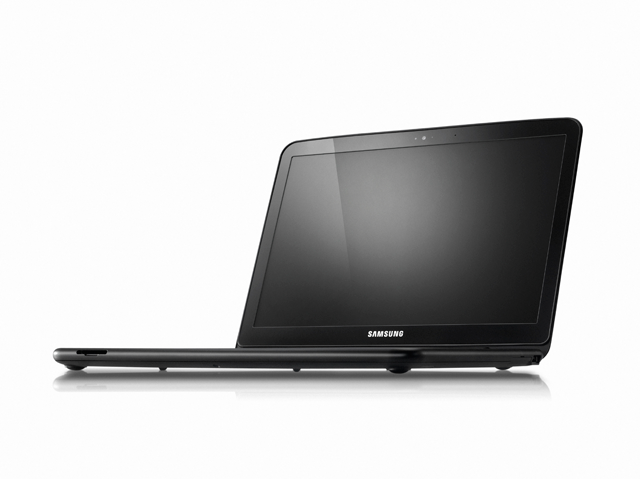
The Samsung Chromebook


Google now licences Chrome OS to manufacturers, who created their own 'Chromebooks'. Currently, both Samsung and Acer have a few models, which run from about $300-$450. At that price, it might be smarter to get a low-end Windows machine, but if you're willing to pay that price for simplicity's sake, it may be worth it. I think that, at this point, Chrome OS and the Chromebooks are great for either simple-computer users who don't want to be confused by the complexities of a "real" operating system, or to be used as a companion to a "real" computer, as Chrome OS has a clean interface, amazing boot time, and easy access to the web.  


Have you played with Chrome OS or the Cr48? Did you take the plunge and buy a Chromebook? What are your experiences with Google's Chrome OS? Like it? Drop a comment below with your experiences.

Thursday, September 15, 2011

5 Android Apps you Need: App 4

This is the fourth part of a five part series. Read the third post here. Check back next Monday for the last part of the series.


The only thing you really can't live without is food, and grocery shopping is never such a fun experience. Make it easier with Grocery iQ, a free app from Coupons.com, which allows you to create personalized shopping lists, get free coupons, and much more.

Coupons on Grocery iQ
When starting with Grocery iQ, you make a list of all of the stores you shop at, and then personalize the aisles in each store, so you know which store has which aisles. Although this is a slightly tedious process, when you're done with it, it's worth it.

You then add grocery items to your list, and add each item to one or more of the stores on your list, and specify which aisle each item is located in. When you then go shopping, you simply click the name of the store, and you see the list of all of the items you need at that store, and which specific aisle it's located in, making your shopping experience a lot more enjoyable.

A great feature of this app is the syncing feature. Grocery iQ also has apps available online and for iOS, so if you have any other device with Grocery iQ, your lists can be automatically shared, and when anyone else with Grocery iQ buys an item, it gets automatically synced with any other users using the same account as you. This makes it great for families, as both a mother and father can share a list on different devices.

Since Grocery iQ comes from Coupons.com, free coupons are integrated to the app, also an extremely convenient feature.

If you eat food, (and I know you do), you need Grocery iQ, so download it for free today, from groceryiq.com or the Android Market.


Hey Twitter users! If you're on Android, check out Plume for Twitter!

Monday, August 15, 2011

Google to Buy Motorola Mobility

Motorola is known by many for it's numerous advancements in the technology of the cellular phone. For one thing, it was the creator of the first cell phone ever made. That two pound "brick" didn't last too long, and now, after Motorola created some of the most popular Android phones, Google feels the need to buy them.

In a press release put out earlier today, Google said that they were going to buy Motorola Mobility Holdings, Inc. for $40 a share, adding up to about $12.5 billion. $12.5 billion is quite a lot of money, however, Google does have some really deep pockets.

The deal will be made official at an announcement later today.

Now that the facts have been said, one would have to think about the reasoning that Google would want to make such a purchase.

Larry Page, Google's CEO, said the following about the purchase:

      "Motorola Mobility's total commitment to Android has created a natural fit for our two companies. Together, we will create amazing user experiences that supercharge the entire Android ecosystem for the benefit of consumers, partners and developers. I look forward to welcoming Motorolans to our family of Googlers."


From Page's statement, it seems that this deal has something to do with the people working at Motorola, as well as the partnership that Google and Motorola already have.


From the press conference, it doesn't seem like Android will see many changes because of this buy. Also, Google says they will continue to run Motorola as a separate business. 


So, although it seems the end user won't be too affected by this, we really won't know for a while. We'll just have to wait and see what happens. And hope for the best.


Read the full press release here.

Friday, July 1, 2011

Gmail gets New Look, How you can get it Too

It seems that Gmail, Google's free email service, is taking on the new look that Google.com got recently. It seems that this new red/grey look that Google.com, Google Maps, Google Calendar, and now Gmail, are all getting, is in celebration of Google's newly announced social network, Google+ (Google Plus).

Although Google+ is in an invite only stage, it is not a secretive project, and so we do know that Plus was the first service to receive the new Google look, so we can assume that Plus was the origin of the new theme.

So know that you know why Gmail looks different, you probably are wondering why it doesn't look different. Any change can scare users, so, at least for now, the new Gmail theme is a choice. In my opinion, a good choice, which is why I'm going to give you the simple steps to make this choice.

  1. Log on to your Gmail account at mail.google.com
  2. Look in the top right corner of the screen, where you will see a gear logo. Click on that.
  3. A few options will come down. Click on Mail settings
  4. A settings page with many tabs will appear, close to the right of the page, you will see Themes. Click on that.
  5. The bottom row of themes will have Preview and Preview (Dense) in them. Dense is more compact, but both of them will give you the new look. Choose one, and click.
  6. Viola! You are now seeing the Gmail's new look. Enjoy!
(To undo, follow these same steps, but instead of clicking on Preview or Preview (Dense), choose another theme.)


Help Gadgetator by simply clicking on one of the sharing icons below. Also, like Gadgetator on Facebook by clicking the "like" button near the top right corner of the page. Happy sharing!

Tuesday, June 28, 2011

Google Revamps it's Universal Web-App Look

The new Google.com Interface
Are you tired of that simple looking Google homepage? Do you wish Google would get rid of it's simplistic design, and make it more exciting. Well, thanks to the new Google web-app revamp, you are still out of luck.

The new Google.com design also applies to all of the other Google web-apps, and basically makes Google look simpler, although the Google experience hasn't changed much.

The new update puts the links Google.com all at either the top or bottom of the page, making it easier to see the blankness of the rest of the page. The Google logo is now slightly smaller, and this also makes is easier to see the blankness of the page.

It seems that the new Google color scheme is red and black. Although the actual Google logo hasn't changed, the bar of links to various Google services that hovers above most Google websites has gone from a light grey to a dark black. The site you are currently visiting is overlined nicely in red, and when you mouse over a link, the boxed area around it becomes a dark grey.

This red/black color scheme is more obvious on the actual page of search results. When searching for a word or phrase, the updated Google, like the older version, shows search results in the main area, and has a sidebar on the left side which allows you to search exclusively for images, videos, blogs, ect. This sidebar has changed in a few ways, most of them, in my opinion, for the better. As pictured below, the sidebar's few default search refining options are now spaced slightly further apart, and, while remaining the same font as the previous interface, are now dark grey. Instead of becoming bold when selected, the options now change to the nice shade of red used throughout the site. The icons are now grey instead of colored, and are changed slightly from the previous versions. When mousing over an option, the area around it becomes a shade of light grey.

The search-box area is also slightly changed in this new interface, as it is now boxed in grey and the search button is now a nice, rounded blue button, with a magnifying glass icon instead of the actual word "search". The Google logo on the left of the search box is now slightly smaller.

The new red/black theme makes the Google experience feel much more elegant, as well as simple, but it also makes it feel that the Google logo shouldn't be that colorful. Google has been using it's red, green, yellow, and blue color scheme as a base for it's new services, but some of the latest additions have seen a slightly different color scheme.
The new search interface

Overall, the new Google interface brings a cleaner interface, a simpler experience, and ultimately, more eye candy, something that was not in the early search engines, and has kind of become a new thing. Google was earned a +1 for this one.

It seems that the bar of links on top of most Google websites appears updated for everyone, but the newly designed home and search pages have not yet rolled out to all users.

Read Google's blog post here.


Help Gadgetator by simply clicking on one of the sharing icons below. Also, like Gadgetator on Facebook by clicking the "like" button near the top right corner of the page. Happy sharing!

Wednesday, June 1, 2011

Google Offers Beta Arriving in Portland now, NYC and San Francisco Later


Google had announced their Google Offers service, a service that sends you daily deals for a specific city, a while back. However, the service only started rolling out today, and in one city: Portland, Oregon. If you live in Portland, you can now go to offers.google.com, and sign up to receive daily deals by email. Support for New York City and San Francisco will come this summer, with more cities on their way.

There are many services already that are similar to Google Offers, like Groupon and Living Social, so we kind of already know what to expect. The deals will most likely be for something that you weren't going to buy in the first place, but now that it's 50% off, you might. 

An example given by former Google CEO Eric Schmidt's announcement of the offers service is pictured below, and shows a certain coffee shop, which is offering $10 worth of drinks for only $5. Although you probably won't find those kinds of deals for a Starbucks, it still may save you a bit of money. 


Although I am living in Denver, Colorado, I signed up for the Portland, Oregon offers, but have not yet gotten any deals. Look for an update to this post when I get my first deal. 

Help Gadgetator by simply clicking on one of the sharing icons below. Happy sharing!

Friday, May 13, 2011

Blogger Back Up, We Couldn't Report it was Down

Blogger, Google's easy blogging service, has been down since about 12:30 Pacific time yesterday. This affected, among many others, Gadgetator. We were not able to report the down-coming of the Blogger service, but fortunately, more than 20 hours later, we are able to report to you that the Blogger service is back up and running, pulling Gadgetator up along with it.

Although we do not think that anything on our site was affected from a user's standpoint, we thank you for your patience, as we waited for Google to bring it's Blogger service alive again.

Monday, April 11, 2011

A Google A Day: Huh?

     Early this morning, Google announced a new "product" on their official blog. Google announced that, partnered with the New York Times, they would be launching a trivia game. This trivia game, called A Google a Day, is different compared to traditional trivia games in the sense that, unlike normal trivia, you are encouraged to look up the answer.
The "A Google a Day" Homepage
     The website for the project, agoogleaday.com, shows the regular Google homepage, but the bottom fourth of the screen shows a bar with a trivia question. The area above it, with the Google homepage, is actually showing the internet as it was before the question was released, as to prevent cheating. One is supposed to search through Google and the internet to find the answer.
A Sample Trivia Question
     When I first read that Google was partnering up with the New York Times, I immediately thought that it would have something to do with news. A trivia puzzle just, well, seems strange. Anyway, the answer to the trivia question, along with search tips for how to find it, will be posted on the Google a Day website, as well as in the New York Times, the next day. 
     This is what seems to me as Google's first attempt at a game-like program. With Google working on improving Android, cleaning up their search results, and more, it just seems like a strange move, and was definitely unexpected. 
     

Sunday, April 3, 2011

Google Implements 5 New ways to View Blogger Blogs on April 1st; No Joke

     Google's blogging service, Blogger, allows users to easily create professional looking blogs easily and for free. At the recent tech conference called South by Southwest, Google announced an entire new interface for it's Blogger platform. This new interface with be cleaner and more simple.
     Although the new Blogger interface is not yet in effect, some small new features have been introduced slowly by Google. The newest, and probably one of the biggest, new feature in Blogger is the new ways to view a Blogger blog. This new update brings five new layouts to any Blogger bog, and can be seen by adding a "/view to the end of any Blogger blogs's URL. For example, to view this blog in any of the five new formats, go to gadgetatorblog.blogspot.com/view.
     The new formats are called Flipcard, Mosaic, Sidebar, Snapshot, and Timeslide. All of these show the blog posts in different ways. For example, Flipcard is just all of the posts arranged a little squares in a grid that flip around when you mouse over them, while Timeslide is all of the posts in three side by side lists, each smaller than the one before it, going by date.
Flipcard

Mosaic

Sidebar

Snapshot

Timeslide
      A lot of these views are almost completely based on pictures, for example, in Snapshot mode, any posts without pictures won't even show up. One of the problems with this is that although Blogger allows you to add pictures to your posts just by entering the photo's URL, any photos that were inserted like this will not show up in any of these viewing modes. I personally have used mostly only photos directly from the web, and plan on downloading them all and reposting them in my blog.
     This is definitely a step towards what Blogger showed off at South By Southwest, it gives any blog a cleaner a simpler interface, and it is something that you probably will see on a lot of blogs very soon.

Friday, March 11, 2011

Google Allows Users to Block Sites from Search Results

     There has been recent controversy over whether or not Google's search results have been becoming less reliable, making sites that one would not find valuable coming up at the top. I talked a lot about this in a recent blog post. Google changed it's algorithm to try to bring higher quality sites up in the search results, and whether or not that worked has also been debated. Now Google, although they are keeping the algorithm change, is giving the user control.
     The new feature allows users to block all results from a specific website from their search results by clicking a link under the site in the results. The actual link is located directly under the website in the search result, next to the Cached and Similar buttons, and reads, "Block all [example.com] results".
     Google announced this feature yesterday on their official blog, and is rolling it out over the next few days. If you don't see it now, expect to see it soon.
     This is yet another attempt by Google to try to improve their results. It seems like a good idea, and it is definitely the first that actually allows human input. It seems like there should be an easier way to block a website, because I don't want to have to go back to Google search results to do it, but for now it should be an effective way to keep unwanted sites out of the search results.

Monday, February 28, 2011

Google Updates Algorithm, Ranks Content Farms Lower

     When you search for something in Google, it's not so simple as to how the order of the results is determined. Google has an algorithm which decides the order of the results. Google gives some tips to site owners, stating what will make your site rank higher in the order. Although this does not tell exactly how the algorithm works, it allows owners of sites which a user might not want to appear in the search results to game the algorithm, and make their sites rank higher than some higher quality sites.
     Recently, people have been claiming that the Google search results have been getting worse, and putting low quality sights above high quality ones. Google responded to that by changing their algorithm to rank low quality, unwanted sites, lower than high quality sites. Since Google is supplying many of the ads on the sites that are now ranked lower with this new algorithm, and is therefore making a lot money of off them, i.t may seem like a bad business move to change the algorithm
     Some sites obviously should be ranked lower than others. For example, there are websites than completely copy popular blogs like Engadget, but put ads on the side which they get the money for. I personally had this experience with one of my blog posts being copied onto another blog. Websites like this are called content farms.
     With other sites, it's not so clear where they should go in the search results. Some websites are completely legit, but many users would not deem them useful, and therefore do not want them in their search results. Such sites include eHow
     eHow is a website with many how-to questions and answers. People in the technology business do not seem to like eHow, and think that the content there is not useful. I personally have used eHow and like it. Some of the content may seem simple, but a lot of it is useful information. 
     Before this algorithm change, a search for any how-to question would usually bring an eHow article at the top. Now a search brings in eHow and sites like it after more legit looking sites. Interestingly, the eHow website has a link to a survey.
     The eHow survey asked quite a few questions, all of them having to do with whether or not eHow is useful. This seems interesting, and with the recent algorithm change, I wouldn't be surprised if eHow takes the survey results to Google, saying that the results show that internet users believe that eHow is useful, and that it should rank higher in the search results.
     The obvious response of Google should be that the users surveyed were eHow users, meaning that the general internet does not necessarily think of eHow as useful, and still doesn't wan't it clogging up the search results. 


Wednesday, February 2, 2011

Android announces Online App Store and More at Today's Event

Android - A mobile operating system run by Google
Honeycomb - The codename for the latest version of Android
Tablet - A touchscreen mobile computer that is usually one piece of hardware
Widget - A small application that runs open in a small area of the screen

     Earlier today, Google hosted an Android event officially showing off Honeycomb, and their online android market. They started off with Honeycomb news, and then went on to announce an online Android Market. Google Android's chief Andy Rubin introduced Hugo Barra, Android head of mobile products, to explain android 3.0, also known as Honeycomb.
Tablet With Honeycomb
     Honeycomb was shown only on a tablet device, so we are yet to know much about how it would work on a phone. Honeycomb completely redesigns the Android interface. 
     The status bar, which tells the time, battery life, connection info, and notifications, has been completely removed from the top of the screen, and replaced by a small black bar at the bottom of the screen. This bar slightly resembles the Windows taskbar. The bar tells a user the time, battery information, notifications, and connectivity info. It also includes a back button, a home button, and a multitasking button. 
     When the multitasking button is tapped, a sidebar appears on the left side of the screen, showing you a visual list with all of the currently running apps. When one of the apps is tapped, it seamlessly opens up into full screen.
Tablet with Andoid 2.2
     Honeycomb also focuses a lot more on not having all your apps in a grid, as seen on the Apple iPhone, previous builds of Android, and many other mobile operating systems. In Honeycomb, a user will put a few important widgets on the homescreen, as well as icons for the few most used apps. The rest of the apps will be accessible through a small button near the upper right corner of the screen. Users also have multiple home screens which they can swipe through, each showing different widgets and app icons.
     Honeycomb also comes with a redesigned notification system. When a notification pops up, it won't be intrusive, it will lay at the bottom right corner of the screen, but will still show some information about the notification.
     Google also included the application bar in Honeycomb. The application bar is a small bar at the top of an application that includes commands for that program. Windows has know this for a long time, as many applications have small bars with commands such as file menu, edit, and more. Android's application bar's commands can also change based on what is happening right now in the app. For example, in an email app, you might get compose message, and some other commands. When you have a message selected, on the other hand, you might see, delete, mark as spam, and more.
      Google also focused on it's powerful graphics and animation capabilities. The demos Google showed were impressive, but something apple devices could do for a long time.
      Google spent half the time talking about Honeycomb, and the other half talking about it's new online app store, known as Android Marketplace. 
      For a long time, one must be connected on his Android Device to download apps from the Marketplace. At today's event, Google announced it's Online App Store. Like Apple's online store, the online app store will allow you to download apps away from your computer, rather than have to buy them through the phone. The app store looks nice, and kind of resembles the app store for Google Chrome.
Android Market Online
     Unfortunately, you cannot download the app on your PC, rather you can only discover them. 
     The app store integrates sharing, and allows you to share an app on Twitter, but is lacking any Facebook integration.
     Overall, Honeycomb looks great, and the online Android store has been widely waited for, and is much more convenient. I'd like to see the ability to download to the PC and then syncing, and some more social integration, including Facebook. 

Watch the announcement here.